1. Bath & Body Works Hand Soaps
Bath & Body Works has captured a large portion of the soap-buying female population through great scent design and well-timed sales. My wife loves their foaming soaps, and stocks a variety of scents for use throughout the year.
Given this fact, there was NO REASON for them to design the bottles with that narrow, rounded diamond shape that tips over during use once you’ve used over half of the bottle. It’s a nakedly-obvious attempt to turn very willing consumers into a captive market:
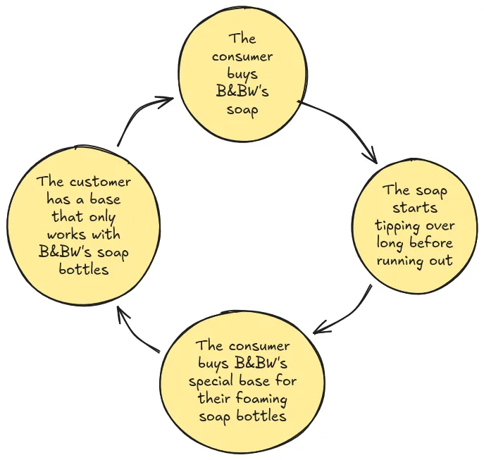
(Again, this would be less weird if they didn’t already have an audience who loves their stuff for its own sake.)
2. Poor Contrast in User Interface Design
For nearly three decades (starting with the publishing of the Macintosh Human Interface Guidelines in 1987, and ending with the release of Windows 10 in 2015), computer user interfaces were designed with an overall goal of Usability. While aesthetics were important, they remained a secondary concern after WHETHER THE SOFTWARE WAS EASY TO USE.
Things took a turn for the worse in the mid-2010s, when The Designers got their hands on things. They decreed that all apps must be Flat and Without Borders.
It started (reasonably enough) as a rejection of Apple’s over-the-top Skeumorphism…
…then (again, reasonably enough), interfaces were simplified so that switching to Dark Mode wouldn’t be too much work:
| Before Flat Design | After Flat Design | |
|---|---|---|
 |
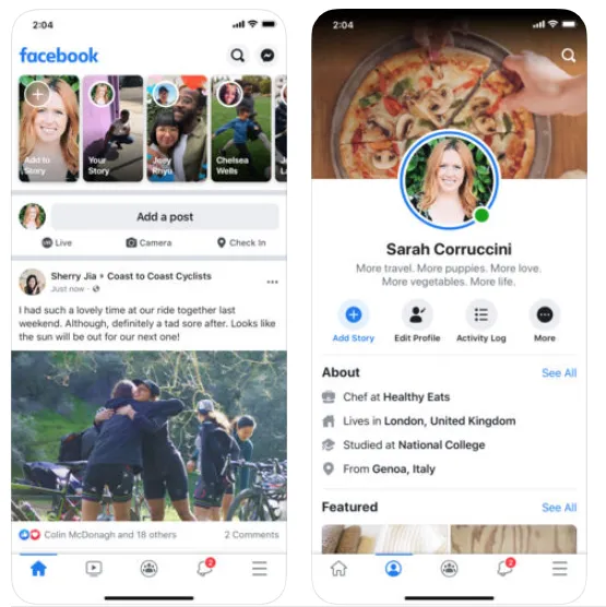 |
To repeat myself for a third time, all of these changes were reasonable. Yet for some reason, taming Skeumorphism and enabling Dark Mode were accompanied by an extreme aversion to VISUALLY SEPARATING LITERALLY ANY CONTENT OR CONTROL PANES FROM ONE ANOTHER:
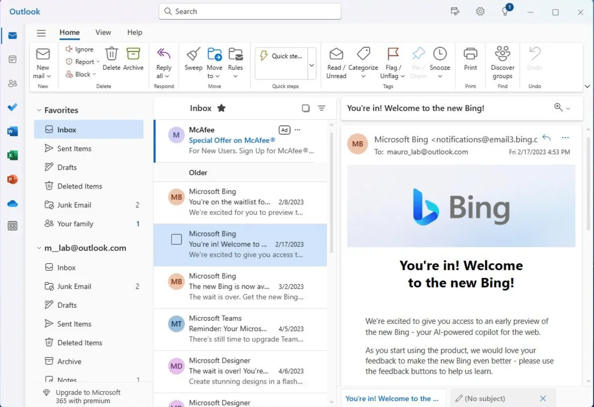 Outlook (the outgoing version, but the new one isn’t any better)
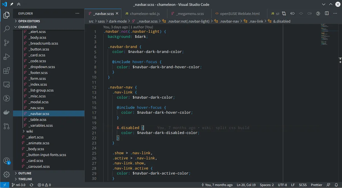 Visual Studio Code
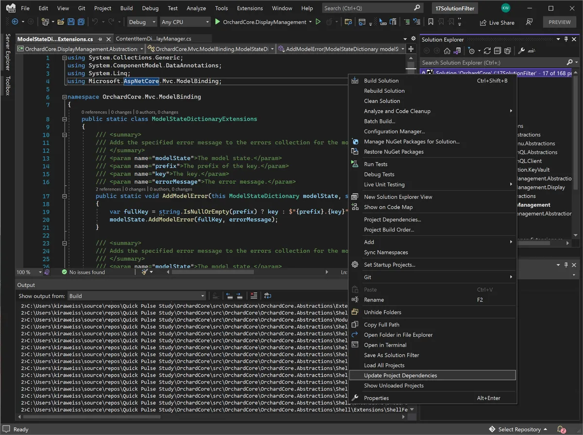 Visual Studio 2022 (I’m glad to say that 2026 is much better about visual separation. They had to take it nearly back to the look-and-feel of VS 2008 to get there though.)
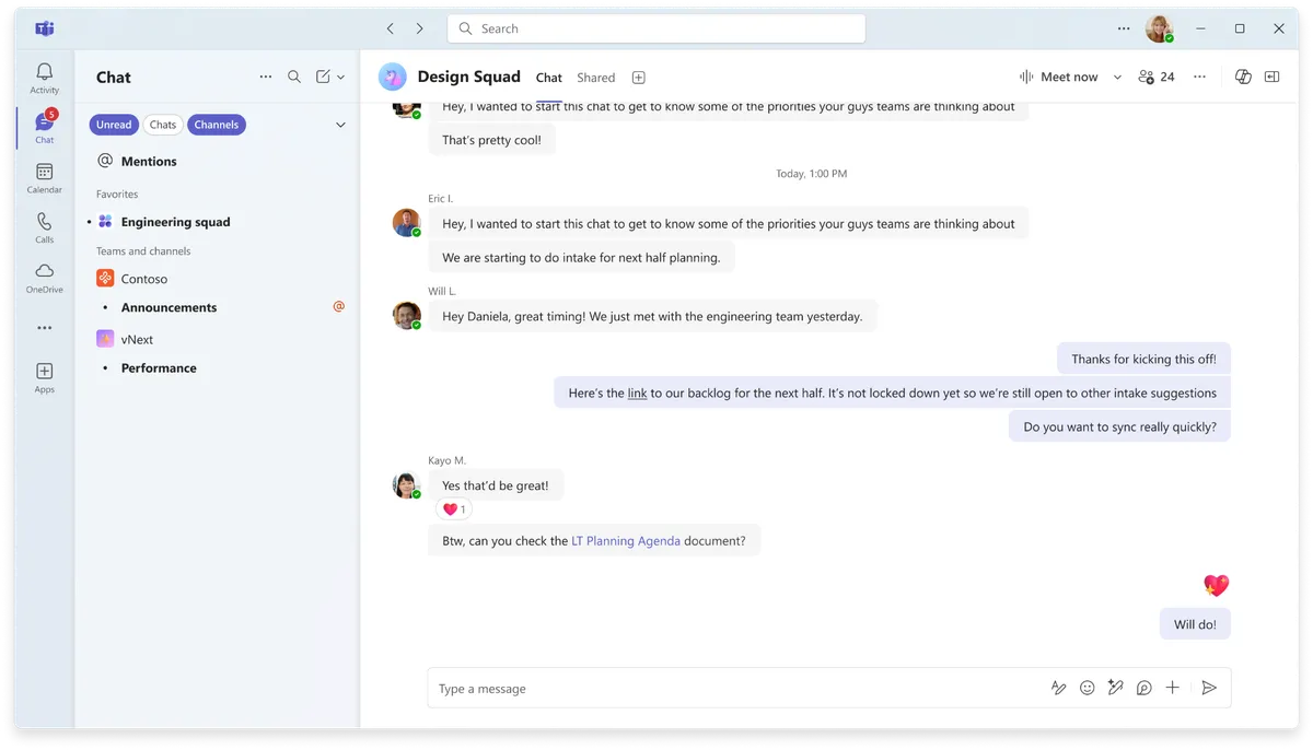 Microsoft Teams
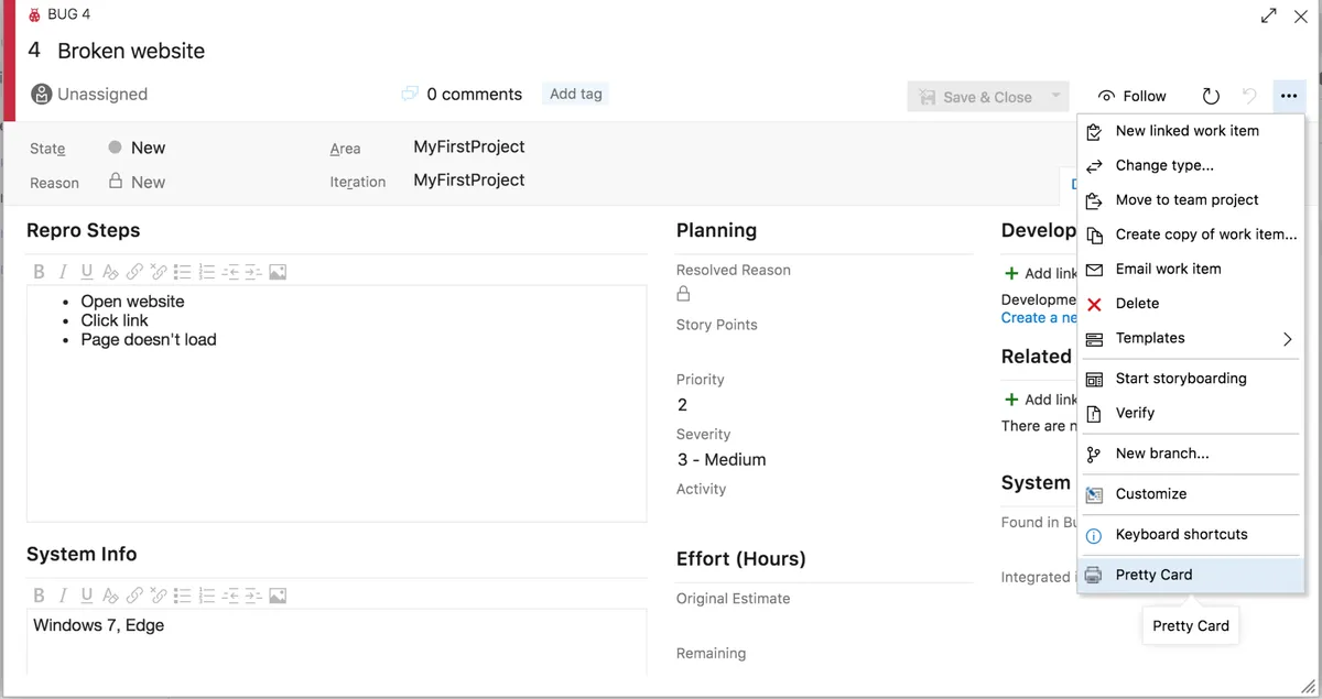 The Absolute Worst: Azure DevOps’ card view
(obviously, Microsoft is a major offender here. But the problem is certainly industry-wide)
Instead of passively flowing through largely areas clearly demarcated by unique colors, users must be continually engaged with the content in order to navigate through it. This leads to a unnecessary sense of fatigue, and endless tiny mistakes that would have been eradicated by a design that didn’t simulate the whiteout conditions after a snowfall.
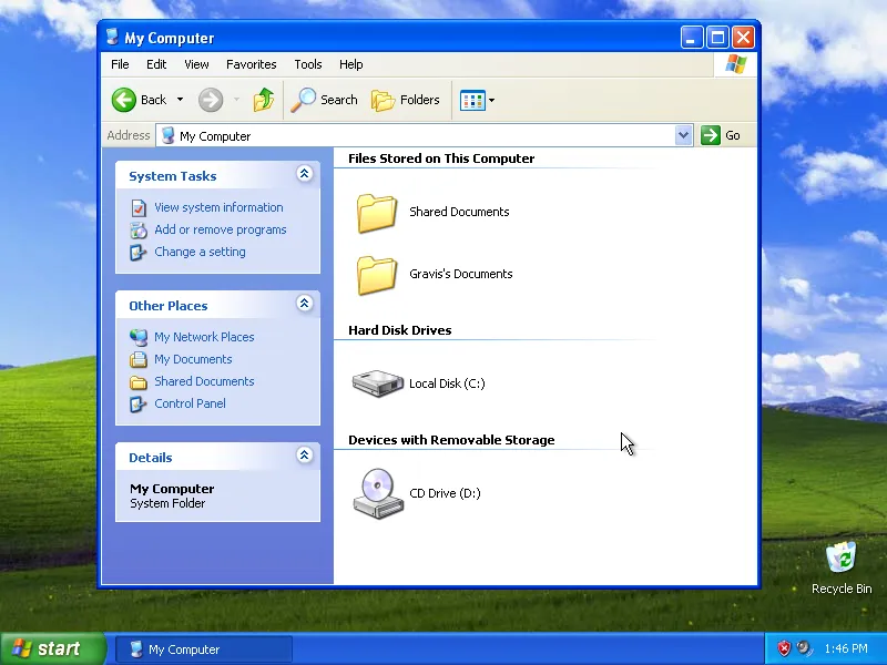
Sometimes, the Old Ways are the Best Ways: